Is the World’s Ugliest Paint Color in Your Home?
 It has been decided. The Ugliest Paint Color in the entire world has been determined by researchers in Australia, and let me tell you, it is hideous. The questions is, have you seen it in some of the homes you have recently seen, and more disturbing, is it in yours?
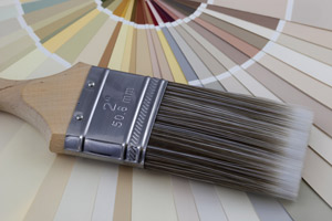
If you are buying or selling, you probably know the importance of the paint colors used in a home. If you are selling, your REALTOR may even advise you to paint any room that is out of that desired, neutral color palette, depending on what your current paint colors are. Essentially, everyone’s tastes differ, so to appeal to the most possible buyers, it is wise to go with neutral colors.
But some people don’t know the difference between neutral and “Pantone 448 C”, the color that has earned the title of “World’s Ugliest Color”. Those people are sending buyers running.
How Was This Ugliness Determined?
Discovery of the sheer ugliness of Pantone 448 C did not originate in the real estate market, though your REALTOR will probably concur that there are some pretty awful paint colors out there. It was actually determined by an Australian research and marketing project that was designed to discourage people from smoking.
When asked, 1,000 smokers decided that Pantone 448 C looked “dirty” and they associated the color with “tar” and even “death”. The color was added to cigarette packaging in Australia, and yes, sales went down dramatically.
So, this research does prove what your REALTOR will tell you about your paint color choices. Color actually does affect how a person feels in a room, and how they feel about the house. It sets a mood, and it impacts whether you like something or you don’t. You may think it is silly to worry about the color of your living room impressing buyers, since paint is so easy to change, but it can impact how much a buyer likes your home deep down inside-that gut instinct. Instinct is often what buyers rely on in determining if a home is “the one” to buy.
What do you do if Pantone 448 C is in your home? Don’t panic. Head to your local home improvement store and:
- Choose a new color. You have to think about what will have broad appeal. How do you make your home look like it could be anybody’s house? Pale, tranquil blues or sage greens have a calming effect, or go neutral with a nice pale taupe, grey, or deep beige to add warmth.
- Take it home to try. Most paint stores or paint departments offer a small tester can so you can try the paint on the actual wall it will be on. The color on the paint can top will not necessarily be the color you see when it is on the wall because lighting affects everything.
- Primer is a good idea in most cases and may be needed to cover up the ugliness of Pantone 448 C. Primer is put on the wall before the actual paint color and not only will this enhance the final look, but it will also help hide the former color on the wall.
Don’t let a bad paint color hurt the appeal of your home. Today’s most popular paint colors seem to lean toward the warm neutrals and colors that inspire feelings of comfort and tranquility. With a little effort, a paint brush, tape and a drop cloth, you can make the walls of your home more appealing to everyone who enters.
| Previous Post | Next Post |